Steve Barzilay TalGraphic & UX/UI Designer

All work

03 / 09

Locate

Rethinking navigation beyond the signal.
UI/UX · BrandingAcademic ProjectAnimation

Where it sits in the mixMostly interfaces
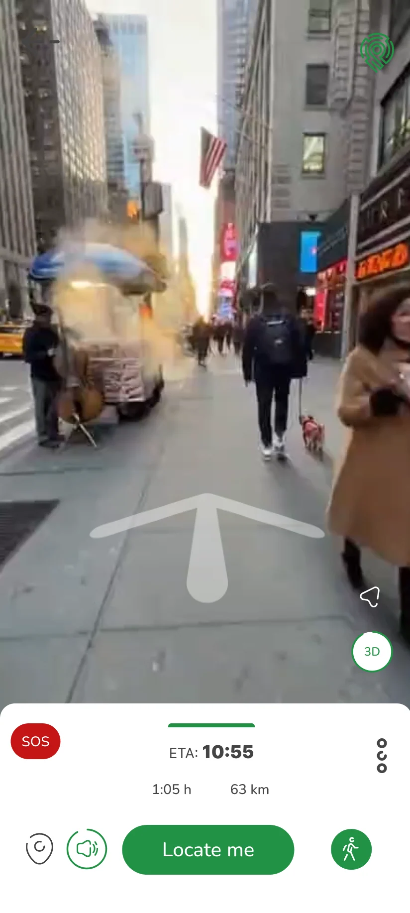
Walking mode: a view of a busy street with a large white arrow showing the way, and a bar beneath it with the arrival time and a Locate me button.
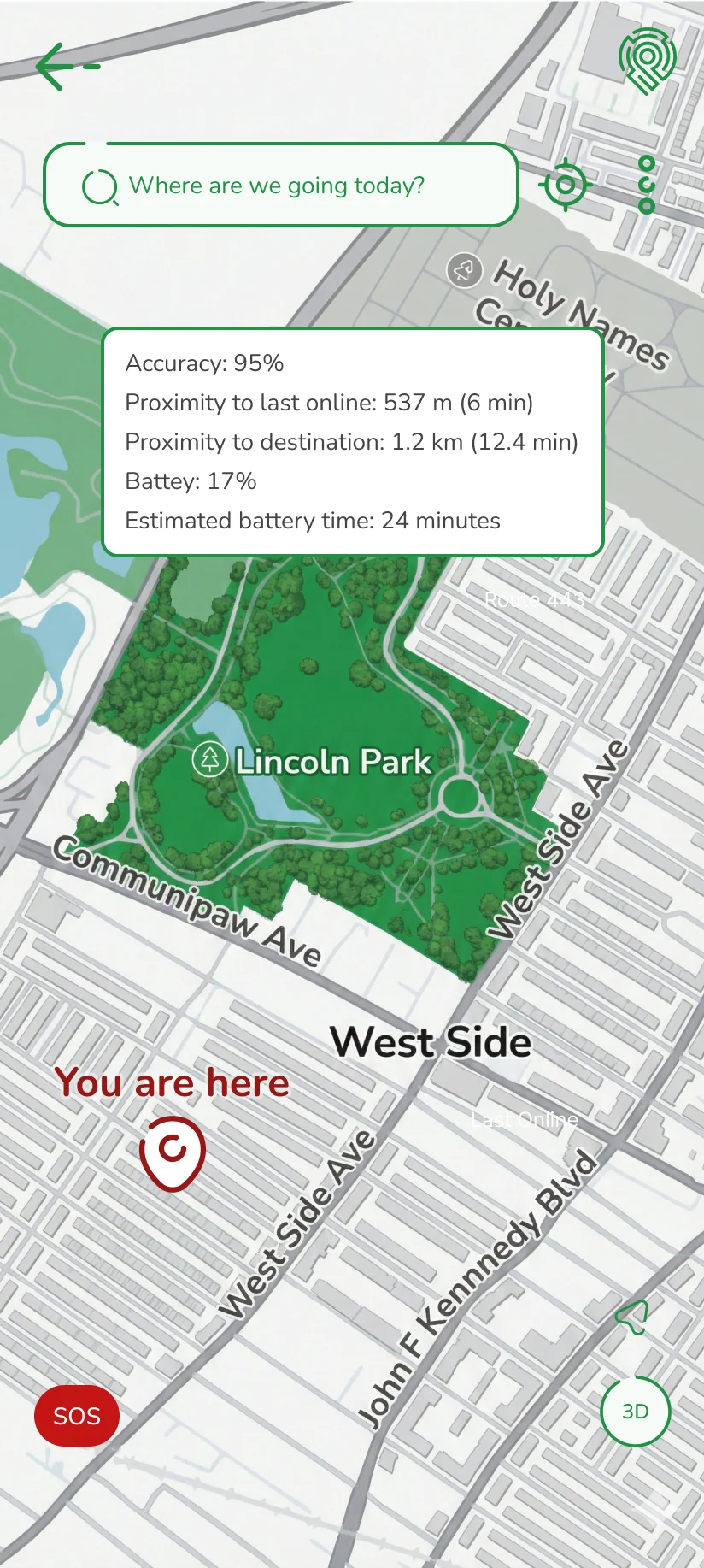
The map after locating: a red “You are here” pin and a card with accuracy, distance from the last online point, distance to the destination and battery.

A concept and prototype for a navigation app that works without GPS. As part of the project we built a distinctive visual language, while preserving the user’s ability to get their bearings in the app in order to get their bearings in the space around them.

Note The demo presents a concept and prototype interactions. The places, routes and street footage on the screens are sample content.

The animation has no sound.

My contribution
I designed an early logo version, contributed to branding and wireframes, and was responsible for interactions and animation. I also created the videos and animated onboarding screens.
Discipline
UI/UX · Branding
Context
Academic Project
In collaboration with
Tal Shabtai · Ruth Bosis

01

No signal, no problem

Locate is built for the moment the GPS disappears. It uses existing technologies from the field of visual positioning (VPS) so that users can get their bearings even without GPS or cellular reception.
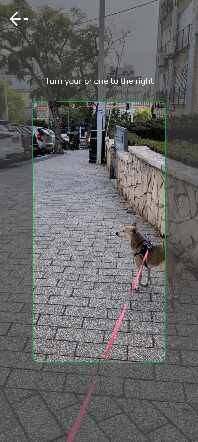
The camera screen: a green frame over a paved street and a dog on a pink leash, with the instruction “Turn your phone to the right”.
The camera asks you to turn the phone
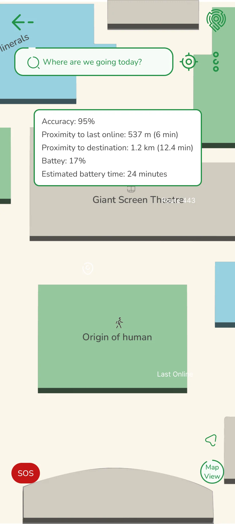
A city map with a green park, a red “You are here” pin and a card: accuracy 95%, 537 m from the last online point, 1.2 km to the destination, battery 17% and about 24 minutes left.
Position and details
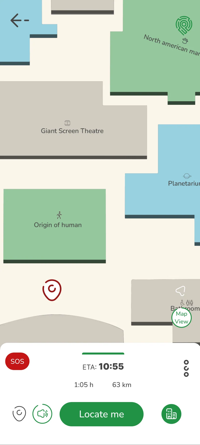
An indoor floor plan with rooms such as “Giant Screen Theatre” and “Origin of human”, beneath the same details card.
And indoors

02

One app for different journeys

The app adapts itself to the different ways of getting around, whether on foot, by bike, by car or on public transport, and offers views suited to the way it is used.
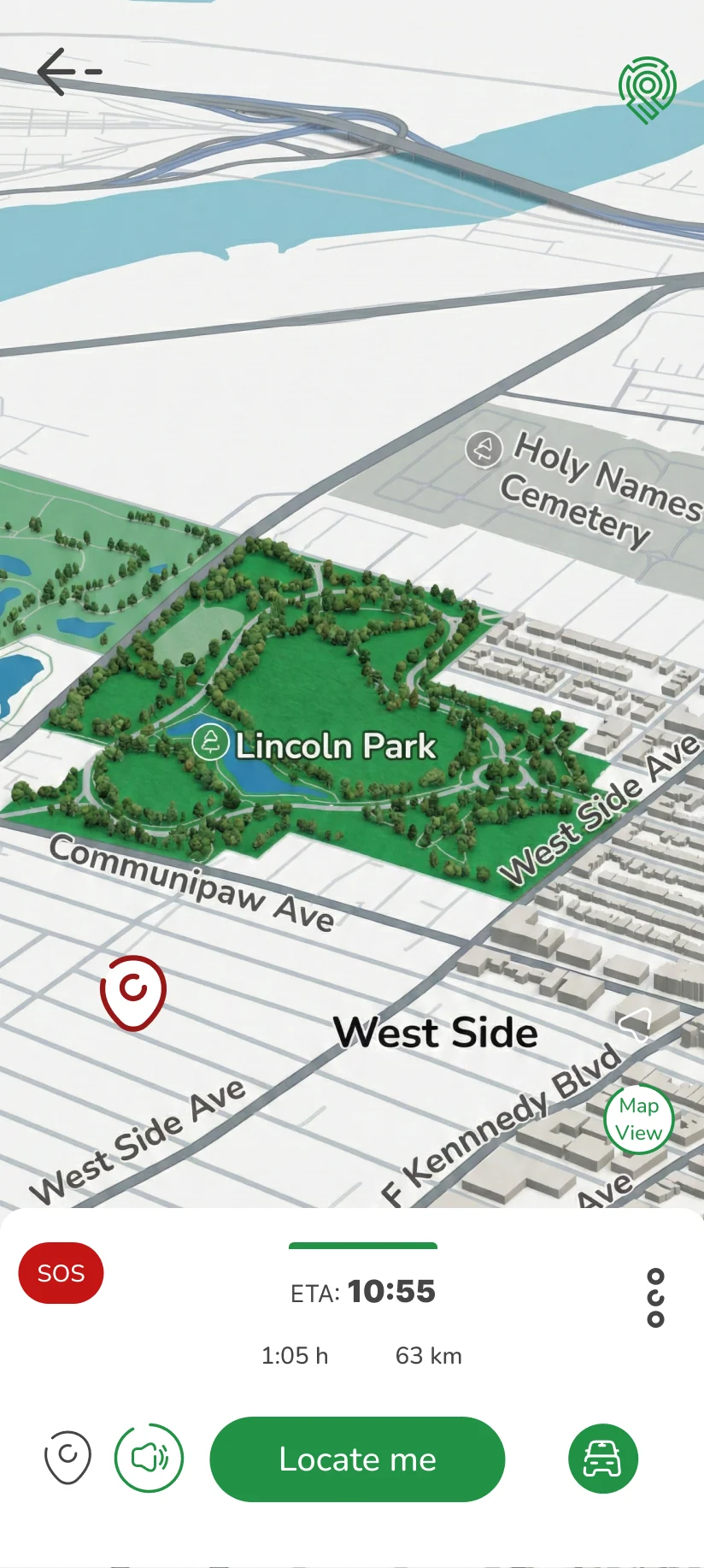
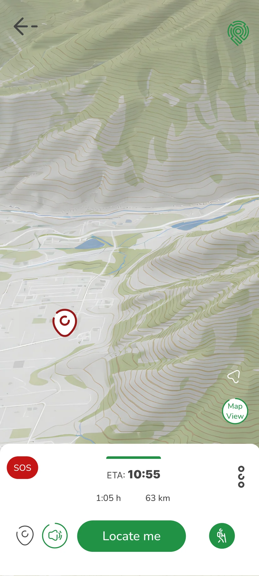
A 3D city map with a red location pin, and a bottom bar showing arrival time 10:55, 1:05 h and 63 km, with a car icon.
Driving
A view of a busy street with a large white arrow showing the way, and the same bottom bar with a walking icon.
Walking
A topographic map with contour lines and a red location pin, and a hiker icon in the bottom bar.
Hiking
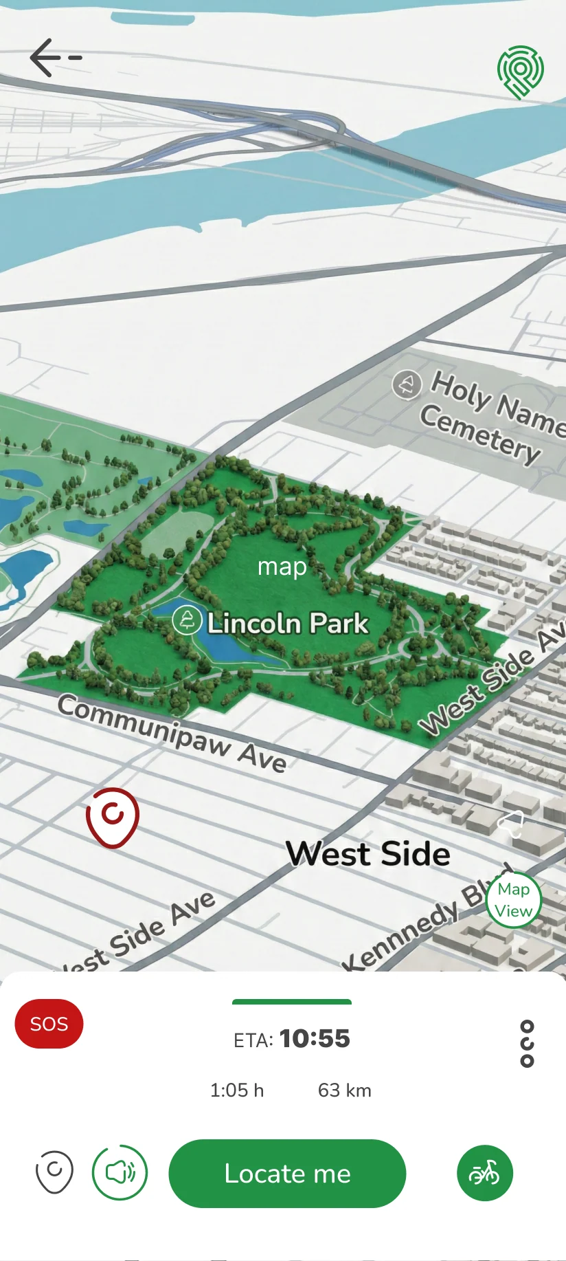
A 3D map of a park and streets, with a bicycle icon in the bottom bar.
Cycling
A floor plan of a building with named rooms and a red location pin, with a building icon in the bottom bar.
Indoors
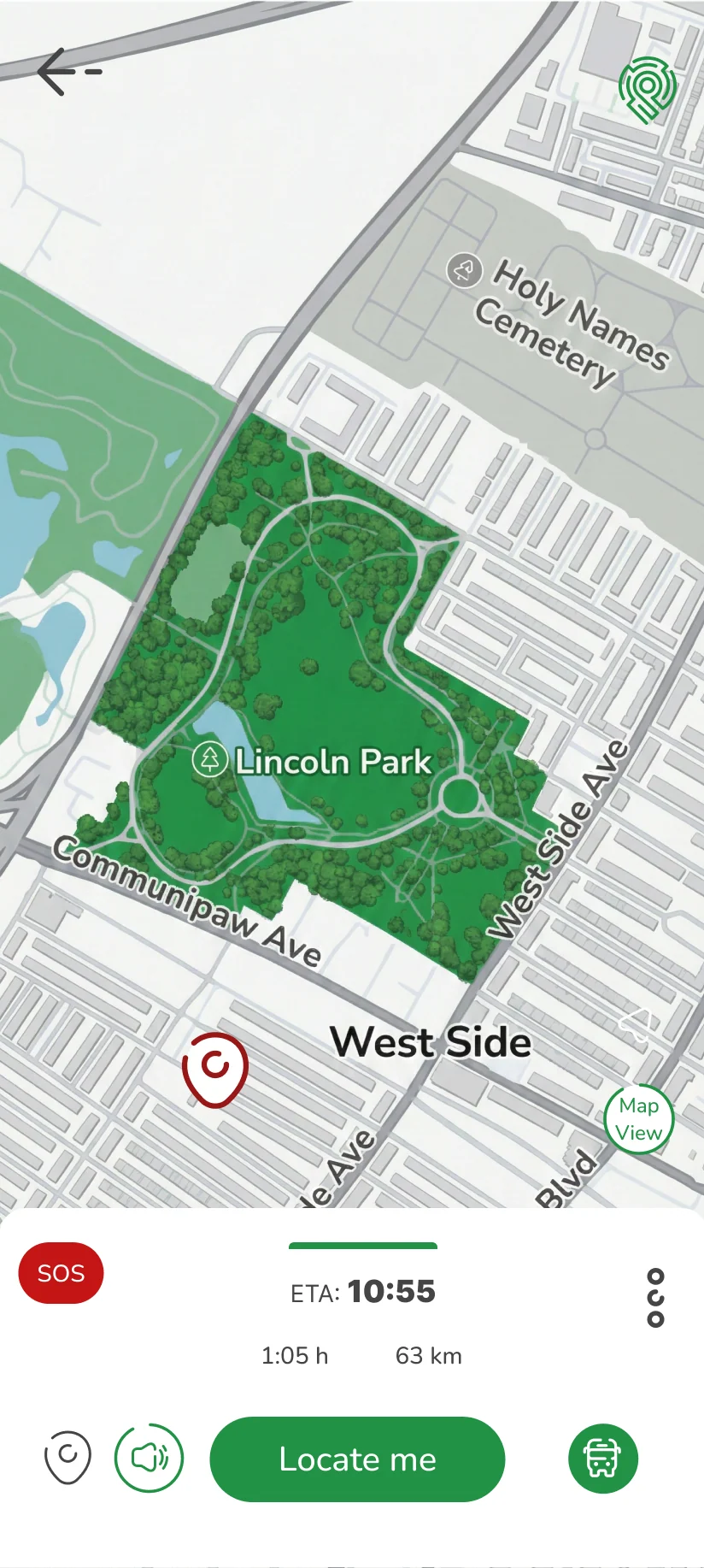
A street map with a red location pin, and a bus icon in the bottom bar.
Public transport

03

Motion and animation

Motion accompanies the app all the way, from the animated onboarding screens to the animated logo that serves as the splash screen and the loading screen.

The onboarding in motion
Sign-up and how you move

04

Route planning

UX based on the familiar navigation apps, for maximum orientation, with a distinctive UI in the language of the brand.
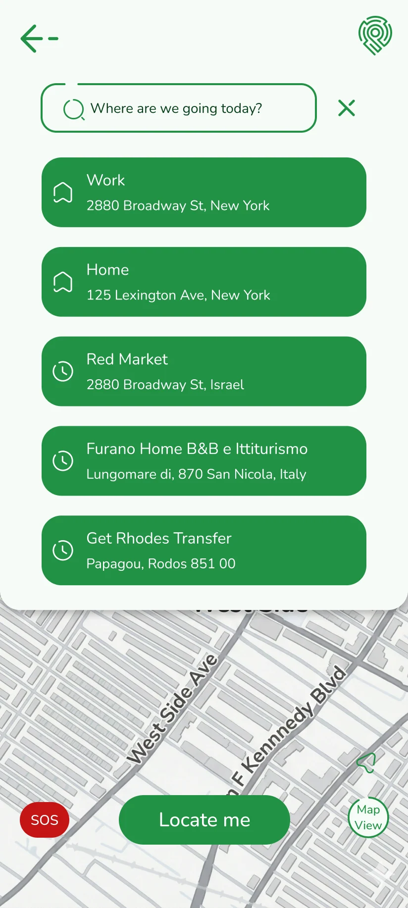
A search field “Where are we going today?” above a list of saved places — Work, Home, Red Market and two recent trips — over a map with SOS and Locate me buttons.
Where are we going today?
From destination to “Go now”

05

Emergency mode

As befits an app made for the moment you lose your way, the emergency screen is prominent, clear and functional.
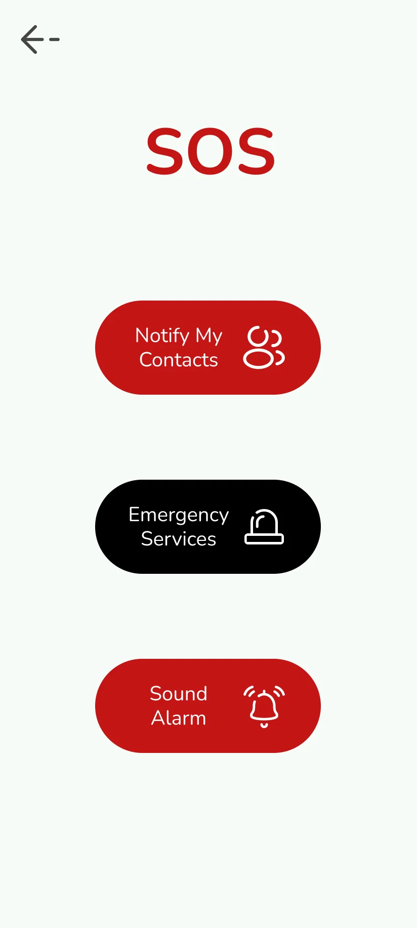
The SOS screen with three buttons: Notify My Contacts in red, Emergency Services in black and Sound Alarm in red.
The SOS screen
The three actions, each with a confirmation

06

The brand

The logo is a location pin that became a hedge maze. The language is soft and round, and is meant to instil confidence in a brand whose purpose is to give confidence on the road.
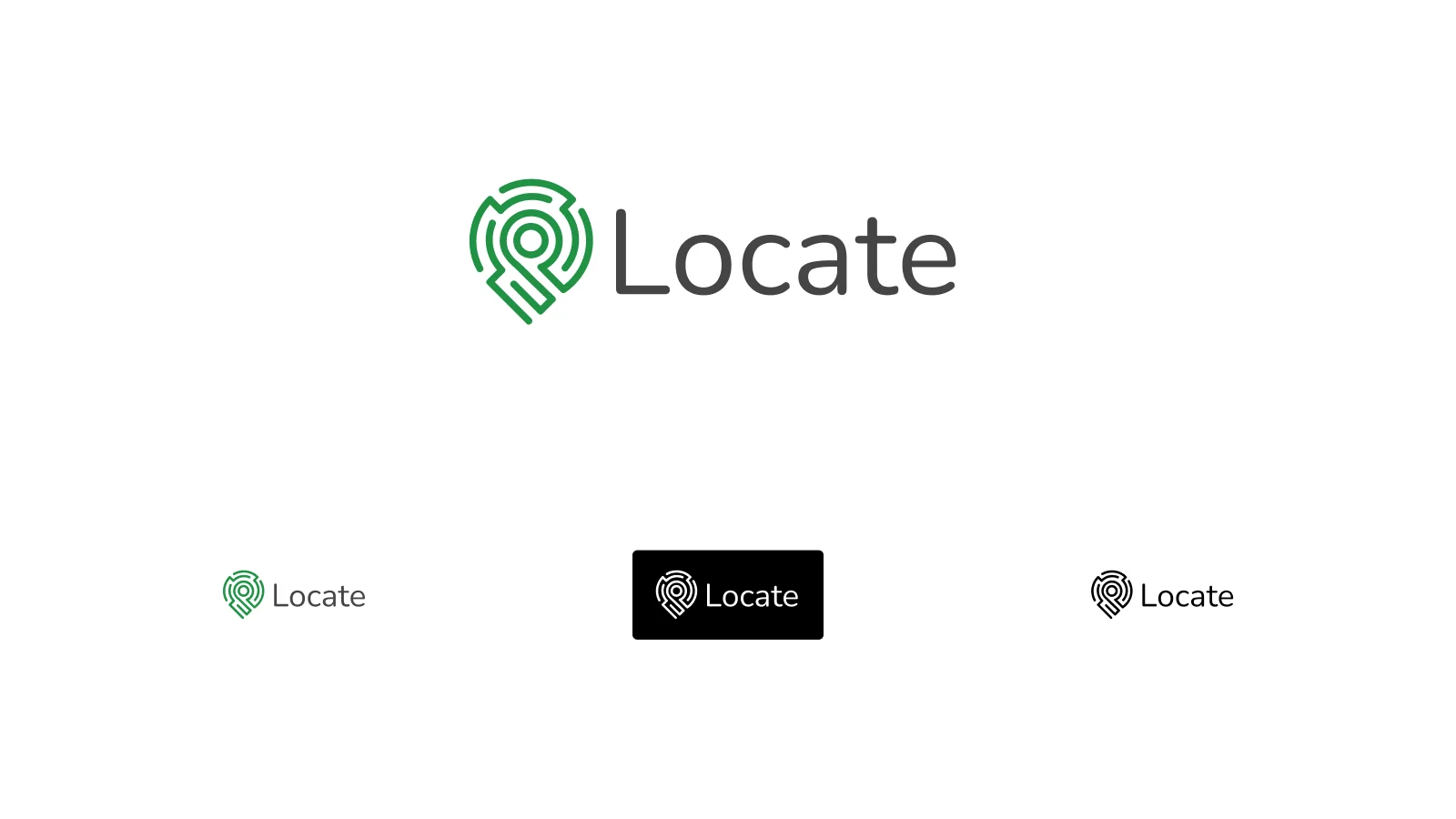
The Locate logo: a green location pin drawn with maze-like lines beside the word Locate in grey, with smaller versions beneath in colour, white on black and all black.
The logo and its versions
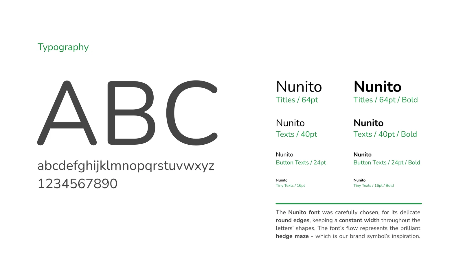
A typography board for Nunito: a large ABC and the lowercase alphabet, sizes for titles, texts, button texts and tiny texts in regular and bold, and a note about the hedge-maze inspiration.
Typography
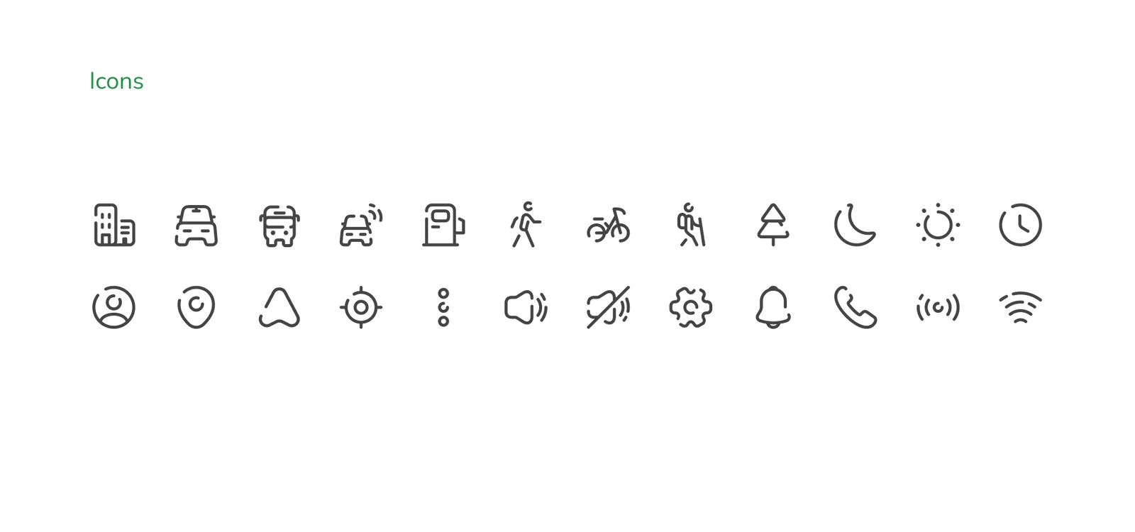
A board of 24 rounded line icons: building, car, bus, fuel, walker, bicycle, hiker, tree, moon, sun, clock, person, pin, arrow, target, menu dots, sound, muted sound, settings, bell, phone, broadcast and Wi‑Fi.
Icons