
02 / 09
TUTTI
A playful visual language for a stroller brand.
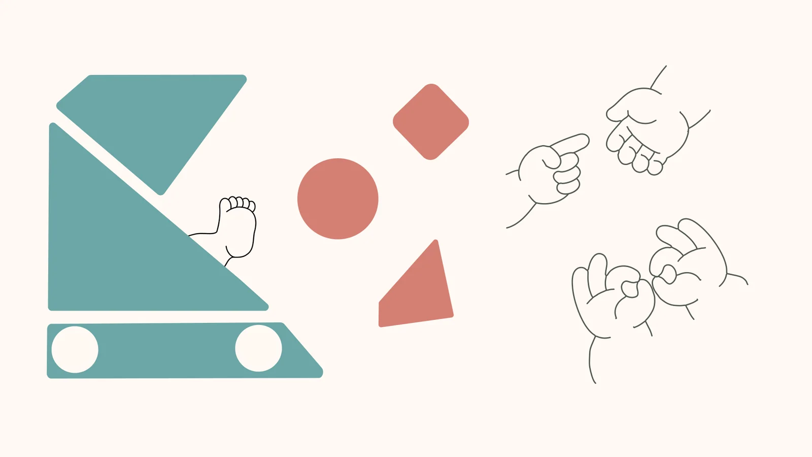
My first branding project for my studies. As a young parent would, I initiated a brand of modular strollers that suit every budget.
Note The brand and stroller are an academic concept, not a product that was manufactured or sold.
- My contribution
- Concept, visual identity and applications — all work by me.
- Discipline
- Branding · Graphic Design
- Context
- Academic Project
01
It starts with a shape
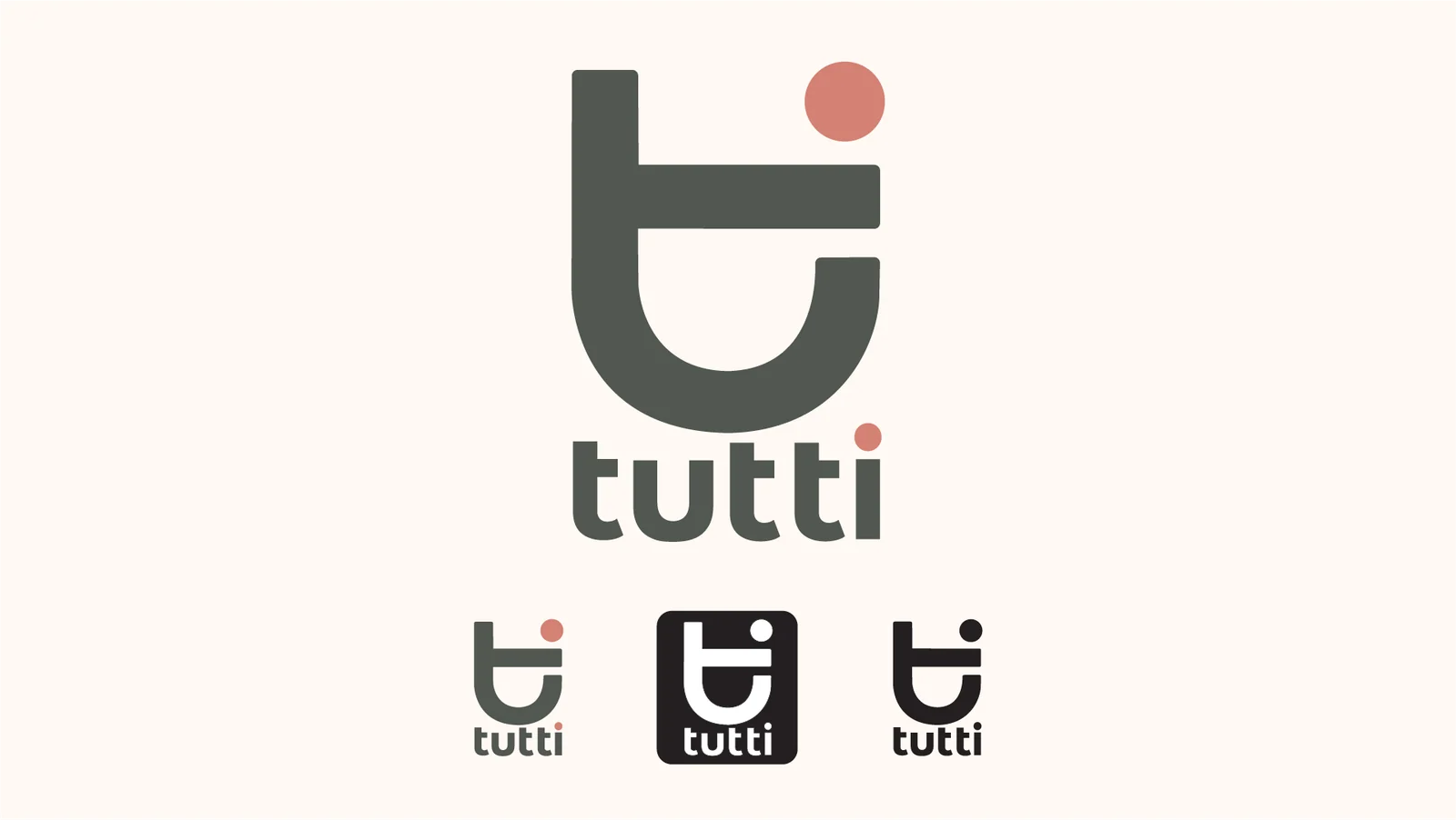
The logo, inspired by the modular concept, is composed of letters from the brand name — t, u and i — and visually it also refers to a baby stroller. The rounded corners, the typography and the quiet colour aim to convey both playfulness and tenderness.
02
Play as a language
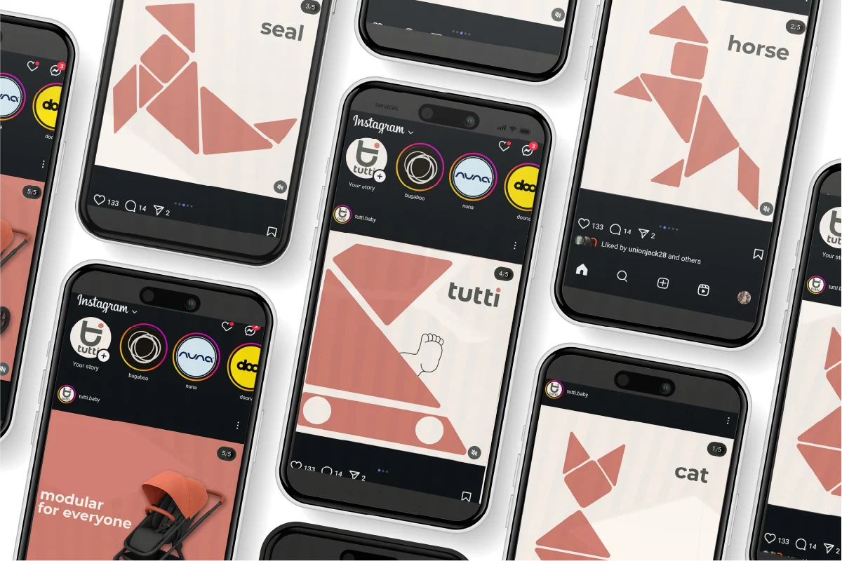
Inspired by the game of tangram, the brand and marketing language is accompanied by geometric shapes that scatter and rearrange themselves, modular like the product.
03
Typography
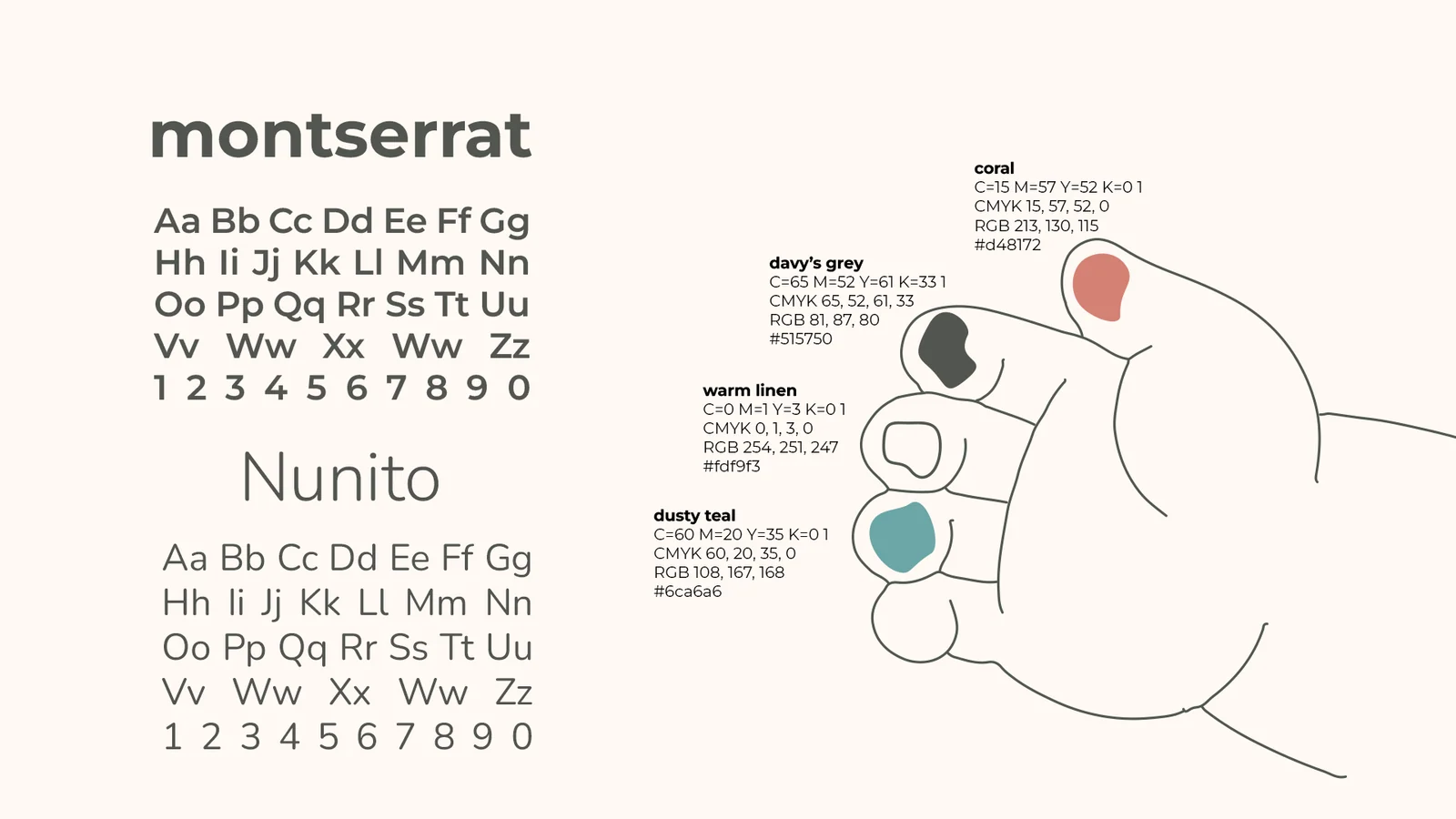
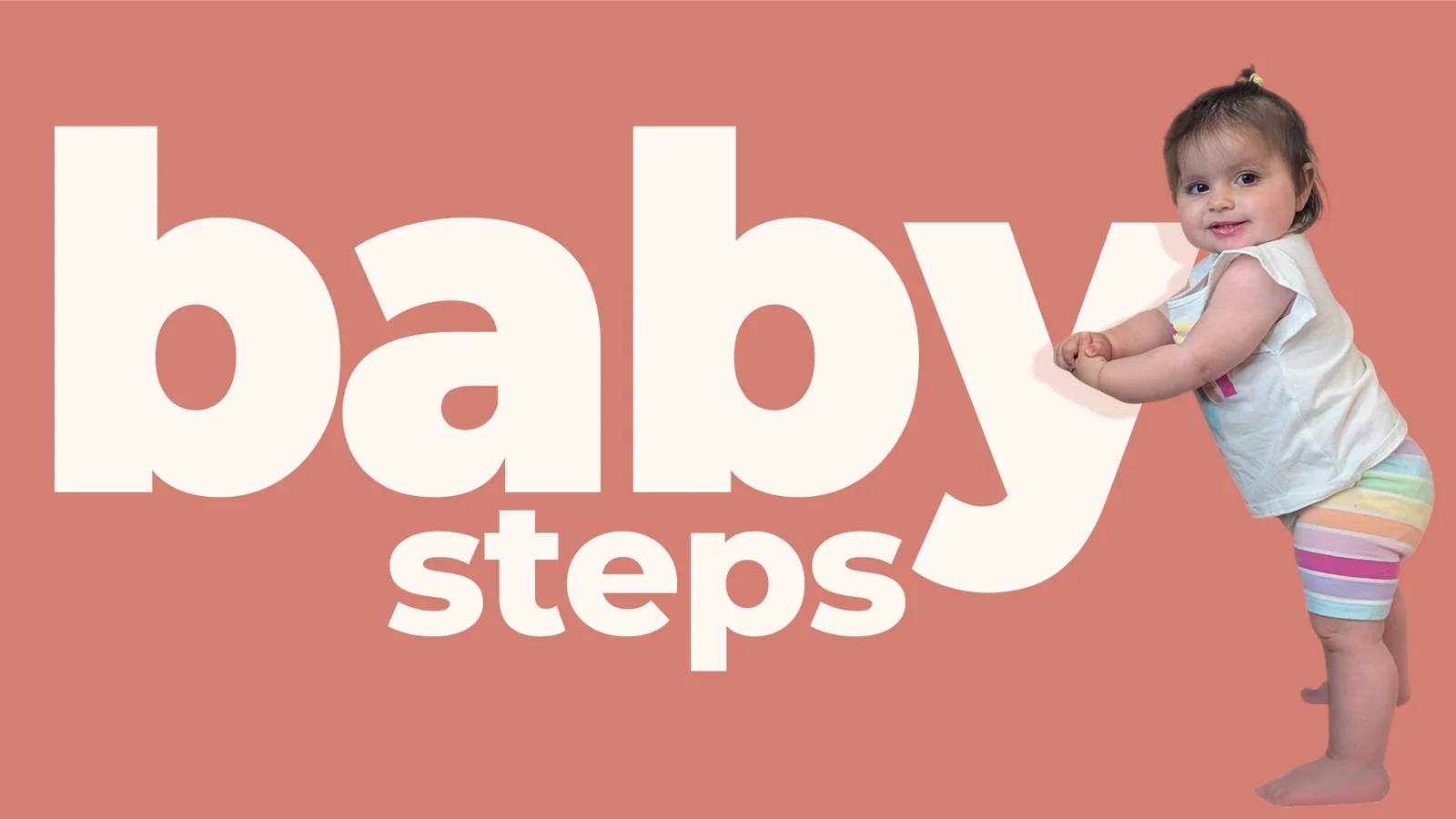
Bold, striking typography that cannot be missed, in lowercase letters only.
04
In the city streets
Billboards, posters, roll-ups, digital and printed assets. The shapes, the colours and the tone accompany the stroller’s marketing journey all the way.
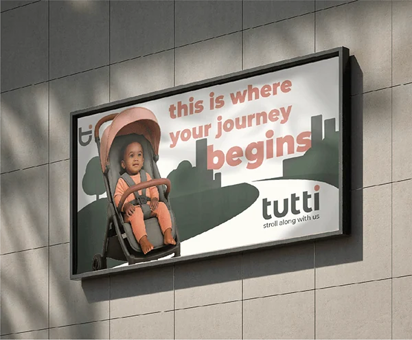
Billboard 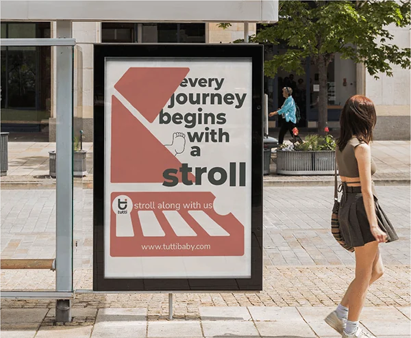
Bus stop 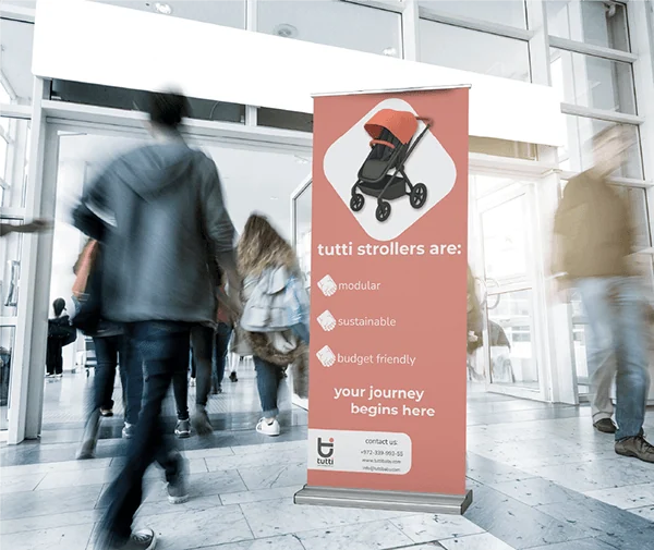
Roll-up 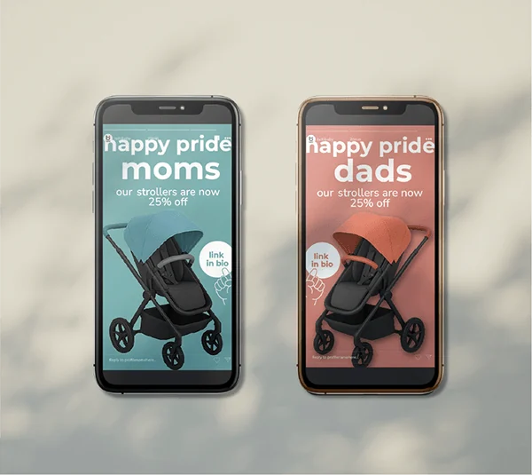
Pride campaign stories 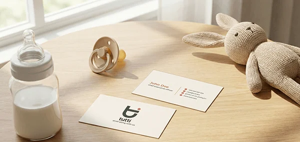
Business cards